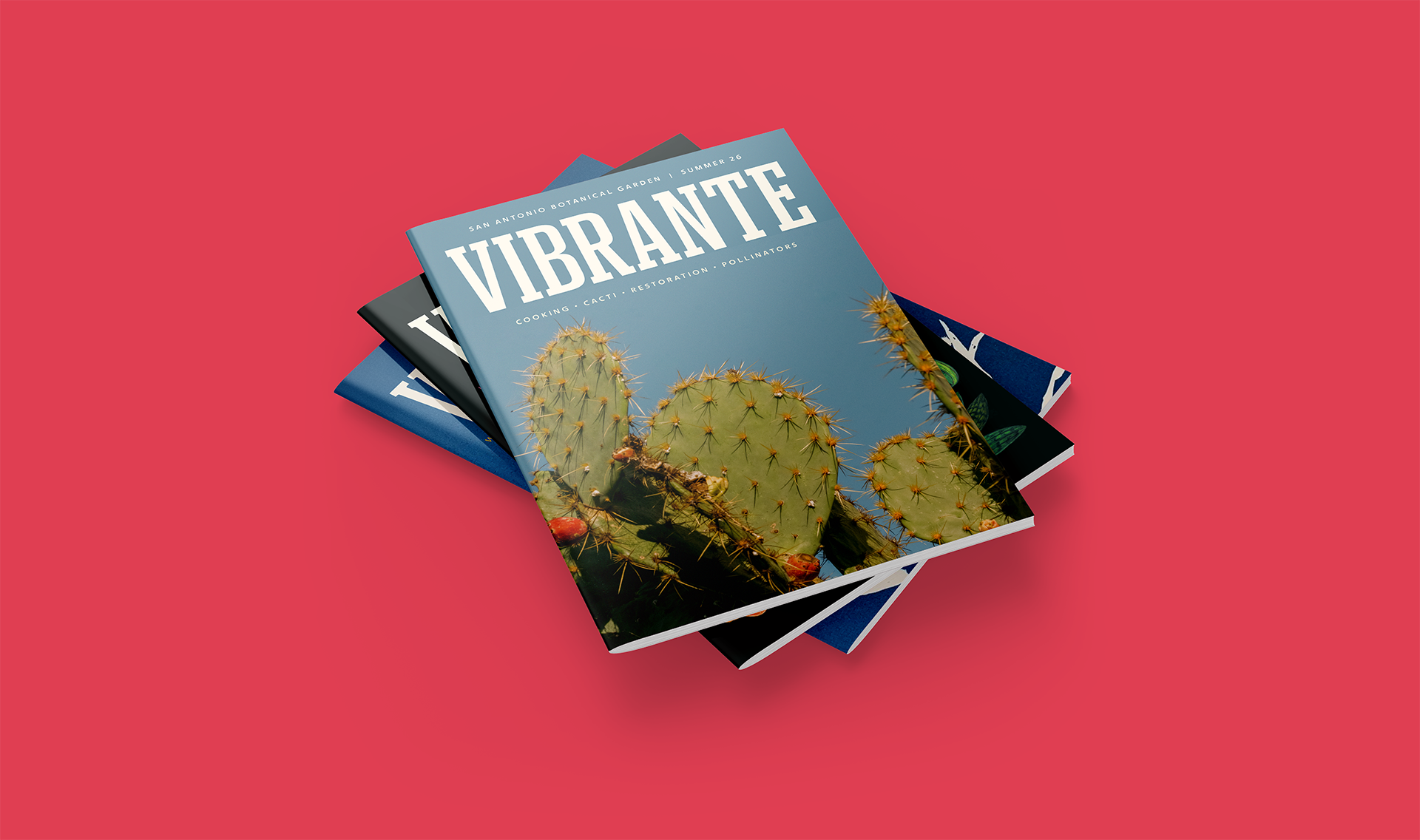
SAN ANTONIO BOTANICAL GARDEN
Planting new ideas.
CHALLENGE
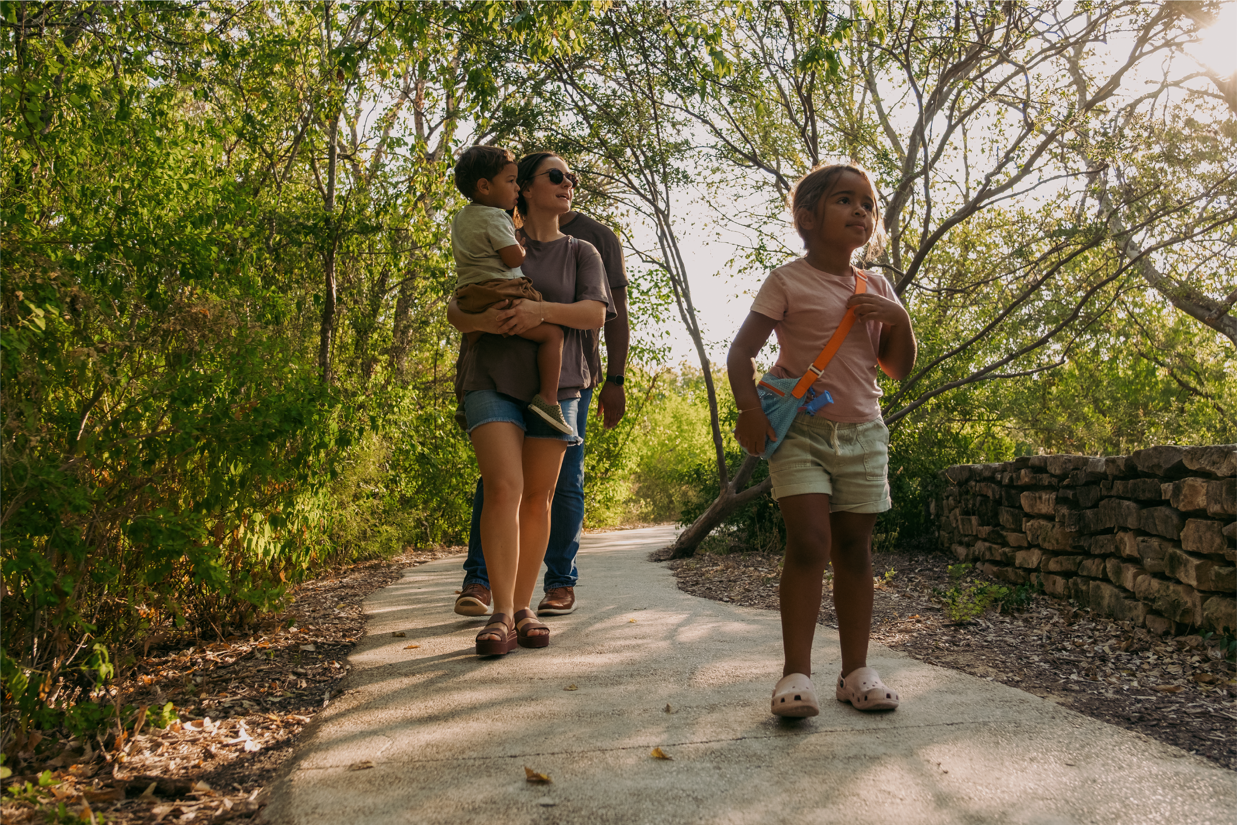
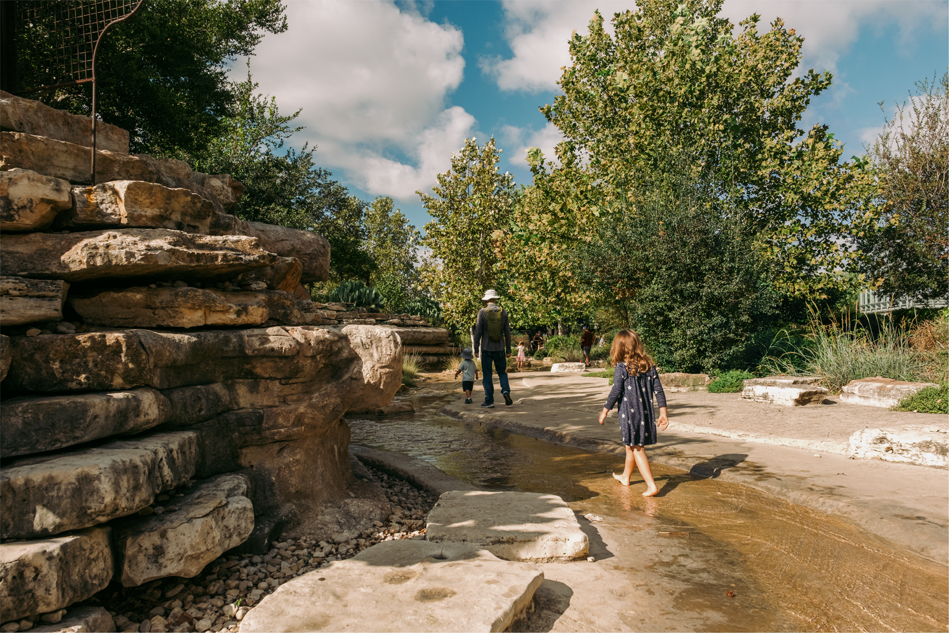
San Antonio Botanical Garden has always pushed the limits of what it means to be a botanical garden. Yet many still don’t see them that way. In a survey, potential visitors ranked “entertaining/fun” as the top characteristic when choosing an experience. However, when they were asked about their impressions of SABG, “entertaining/fun” was one of the lowest ranked characteristics. People don’t know SABG is so much more than just a relaxing place to see flowers or appreciate all the groundbreaking conservation work they're doing — making it harder to attract both new visitors and donors. To increase visitations and support an ambitious $100 million expansion, they needed to update their brand and expand how the public views them.
VALUE
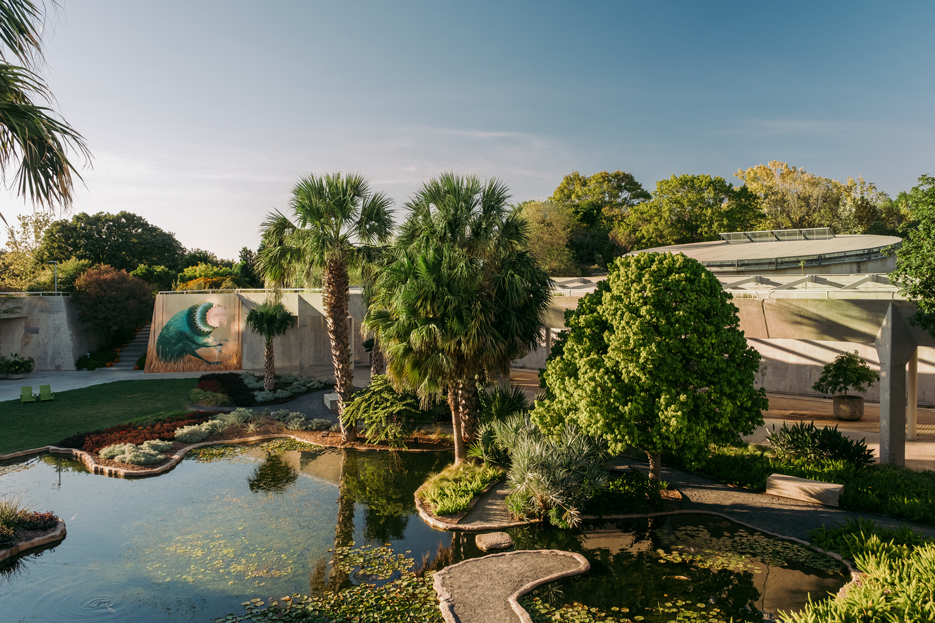
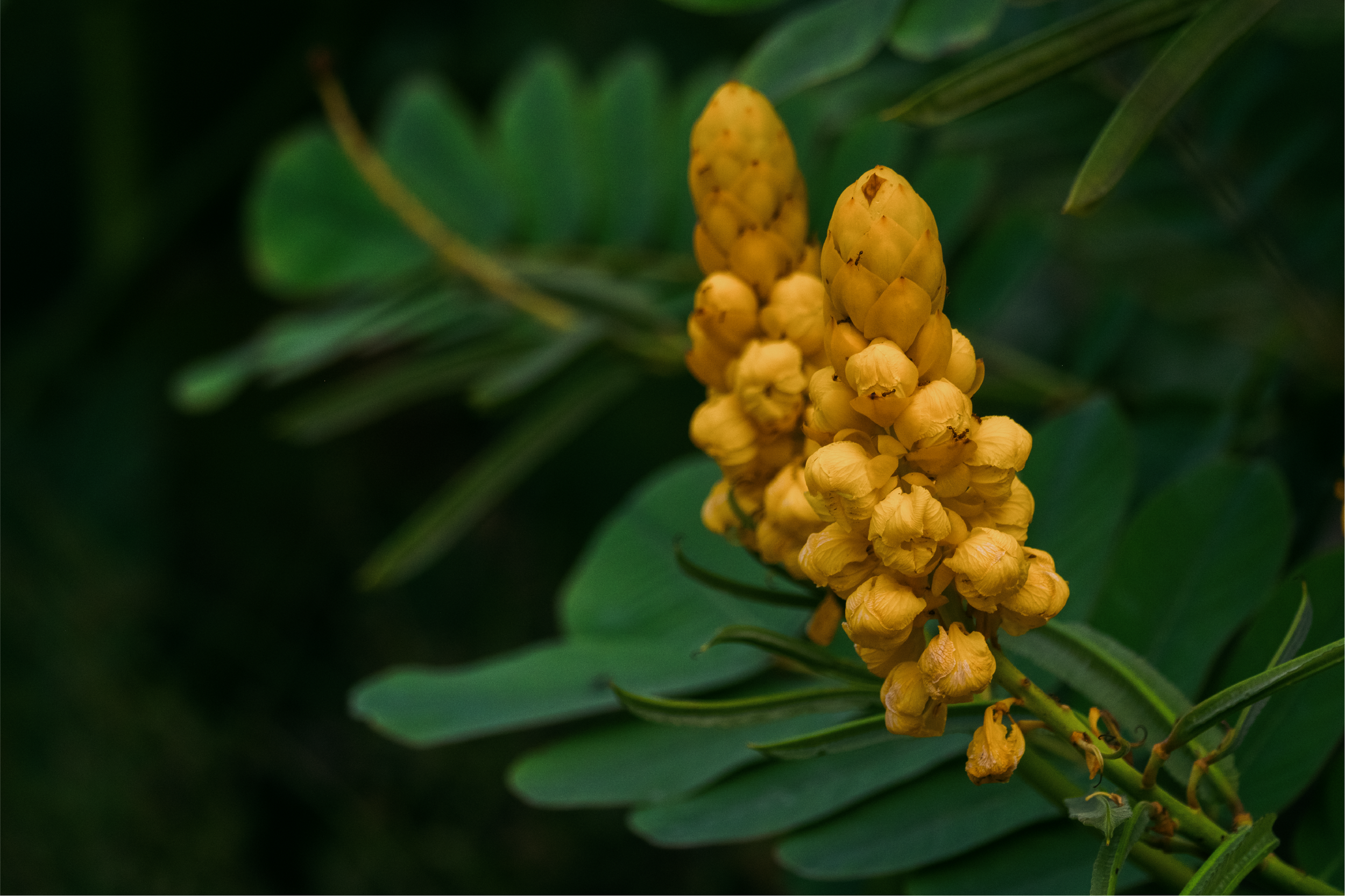
Botanical garden brands tend to all look and communicate in similar ways. Logos almost always feature a plant. And messaging typically positions gardens like museums — quiet and formal places filled with beautiful things to be observed from a distance. Yet SABG is truly different. It has innovative architecture. It’s a key landing stop for all kinds of critical wildlife. It’s located in a unique spot in one of the most unique cities in America. And we haven’t even talked about the plants yet, which include some of the rarest and most endangered native species in Texas. We helped overhaul their entire brand to drive new visitors and donors by challenging the stereotype of a garden and sparking greater curiosity in everything they have to offer.
SERVICES
Blitz
Strategy & Positioning
Visual Identity
Tagline
Narrative
Film
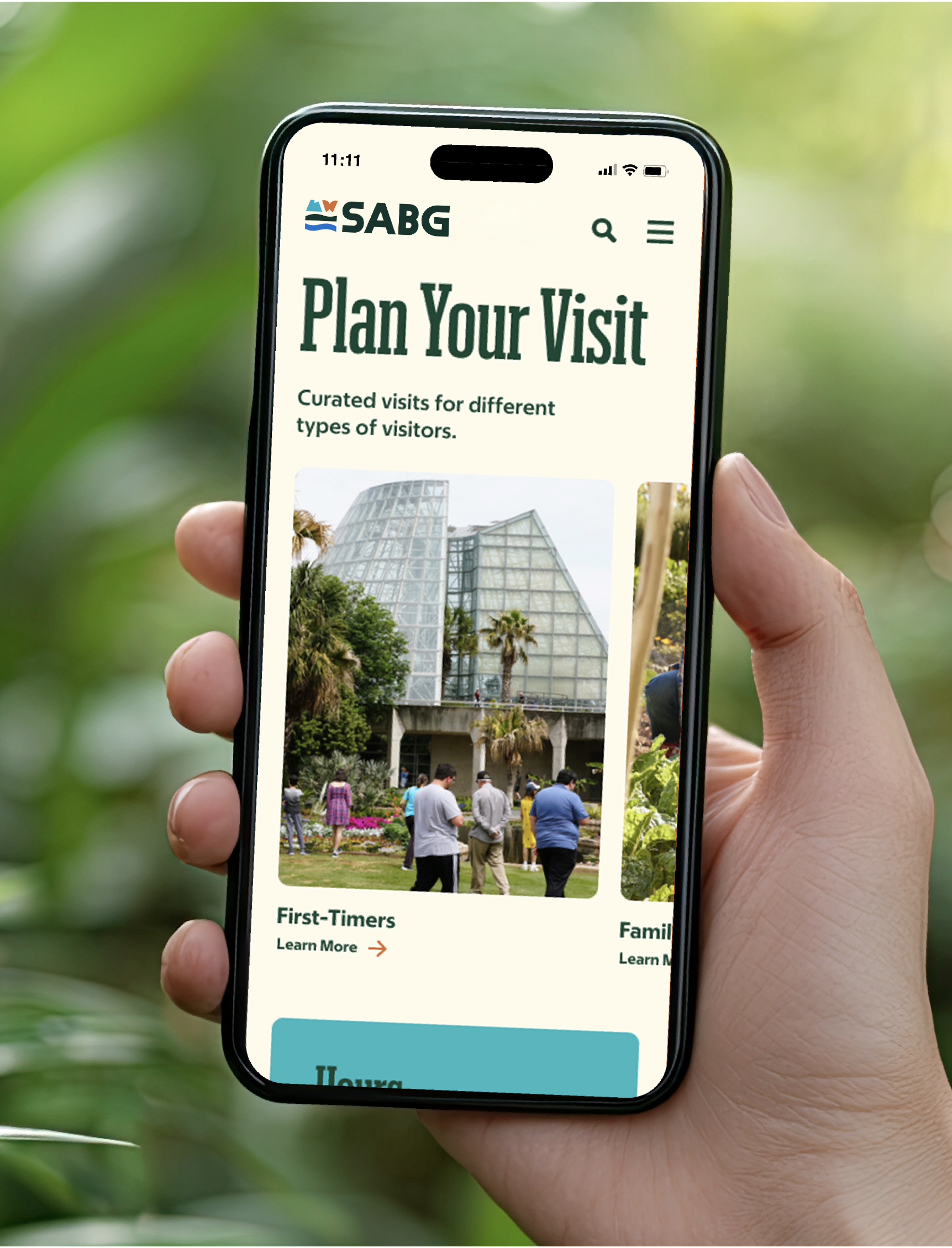
Wayfinding
Social
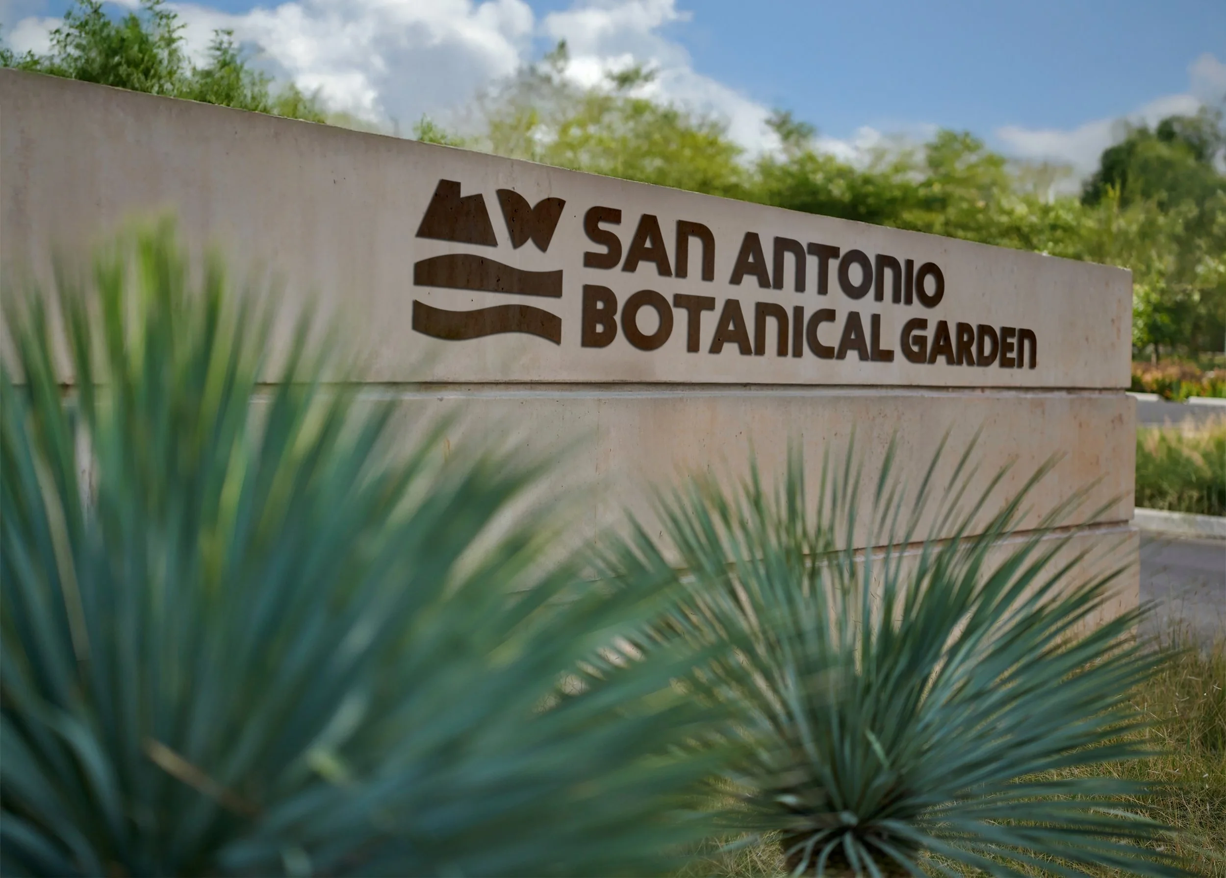
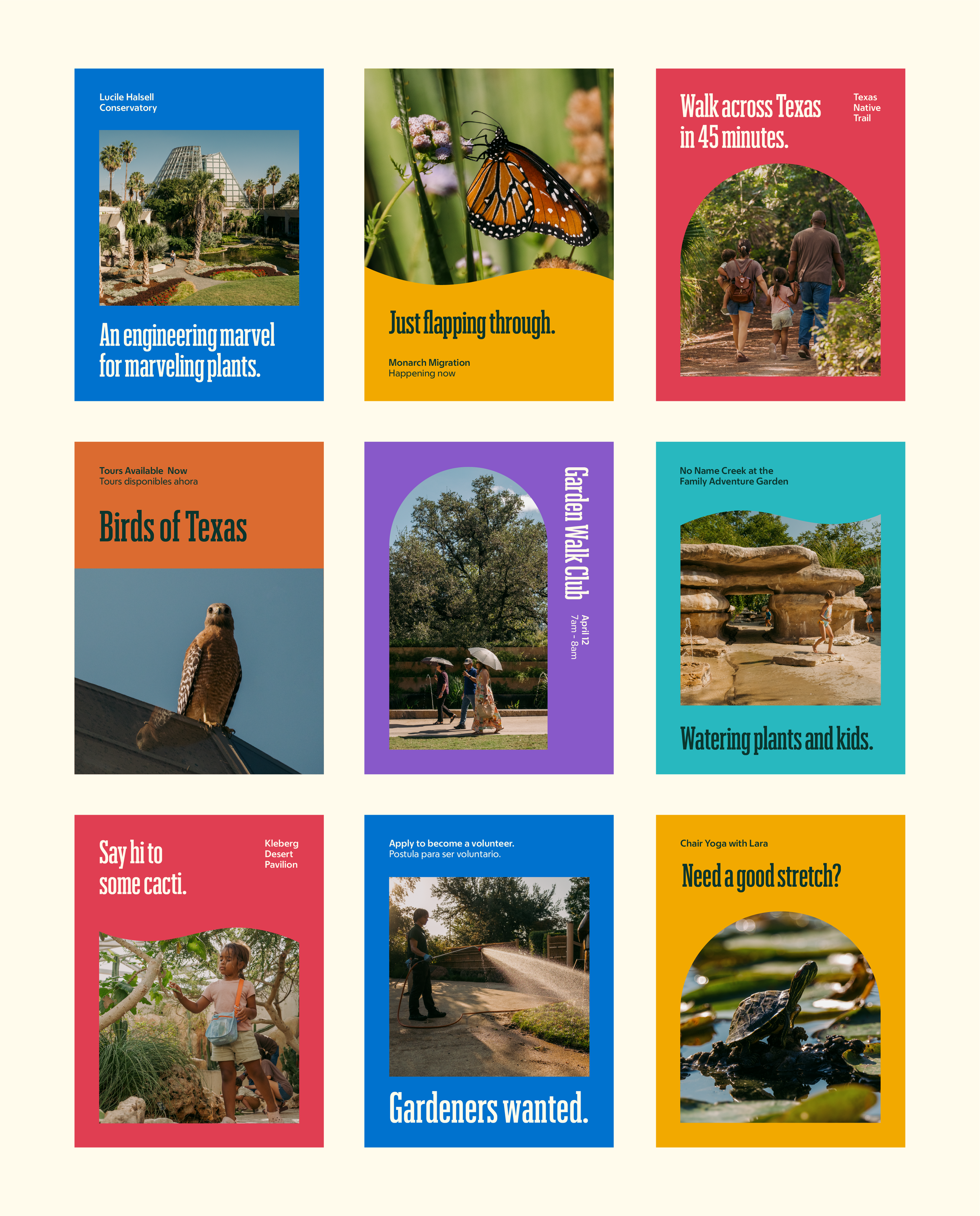
LOGO
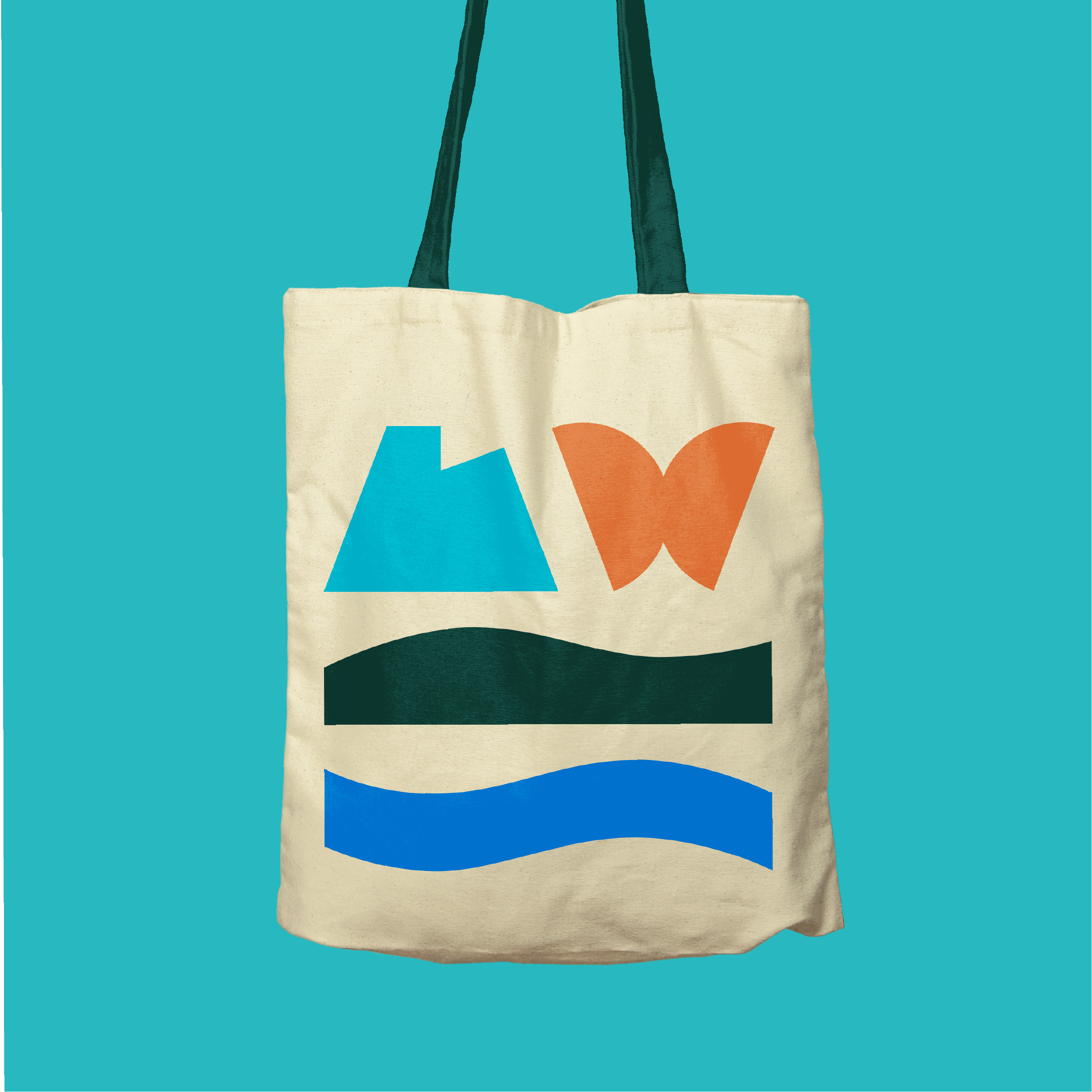
SABG’s previous logo featured a hibiscus icon and represented a famous hybrid developed at the Garden. While it’s a great symbol of their past, it doesn’t symbolize where they are today or their vision for the future. They also needed an icon that could help expand people’s view of the Garden beyond just flowers.
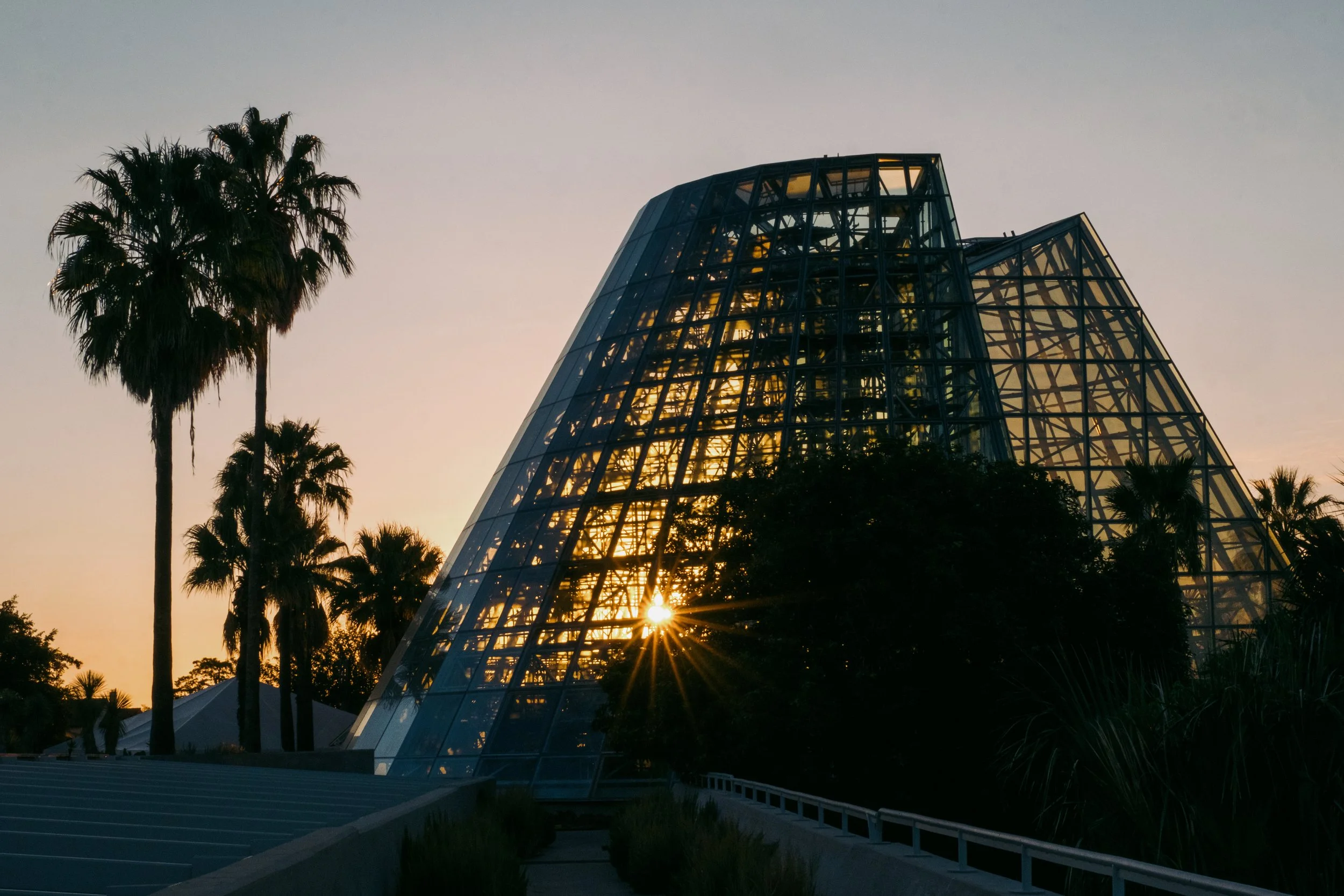
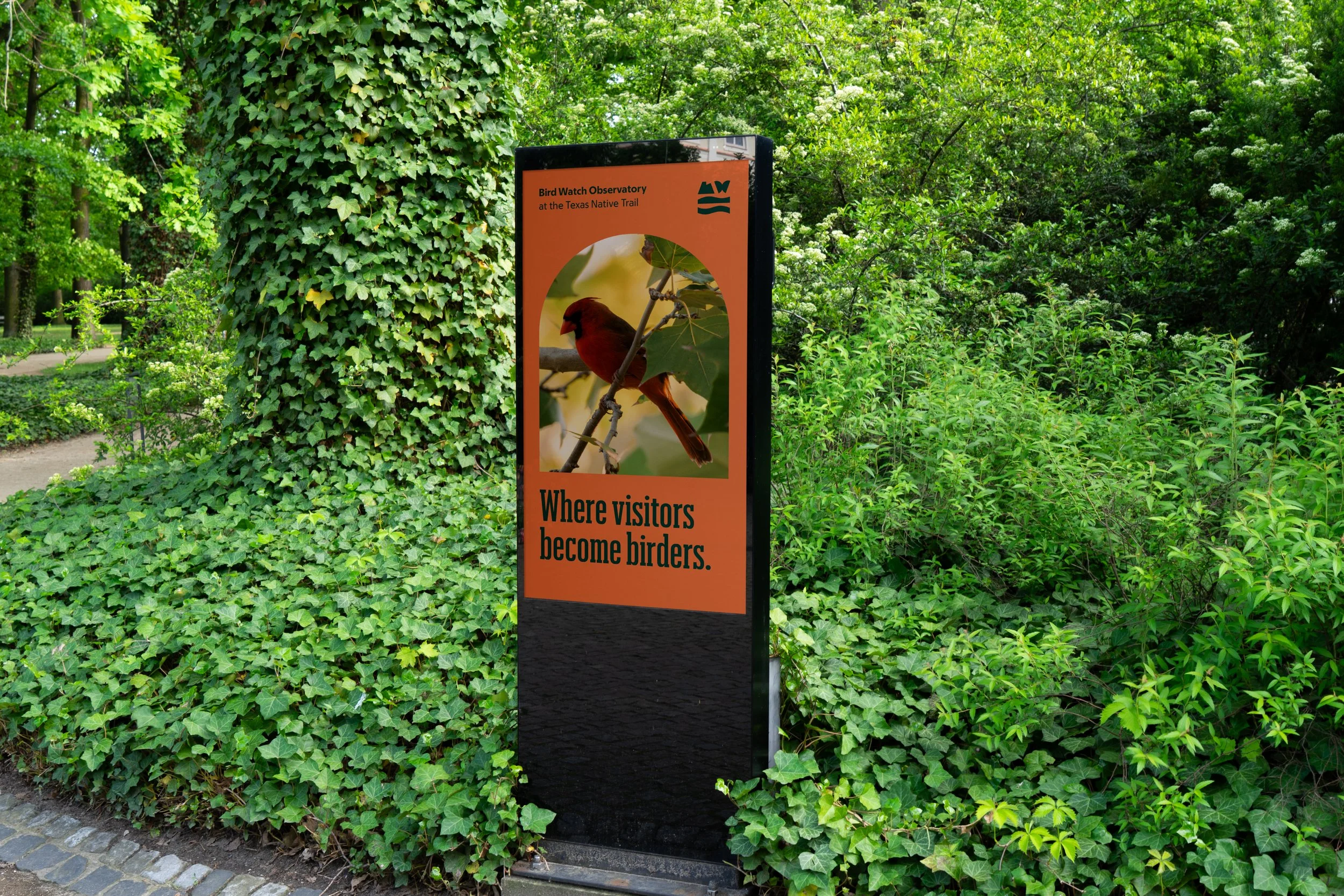
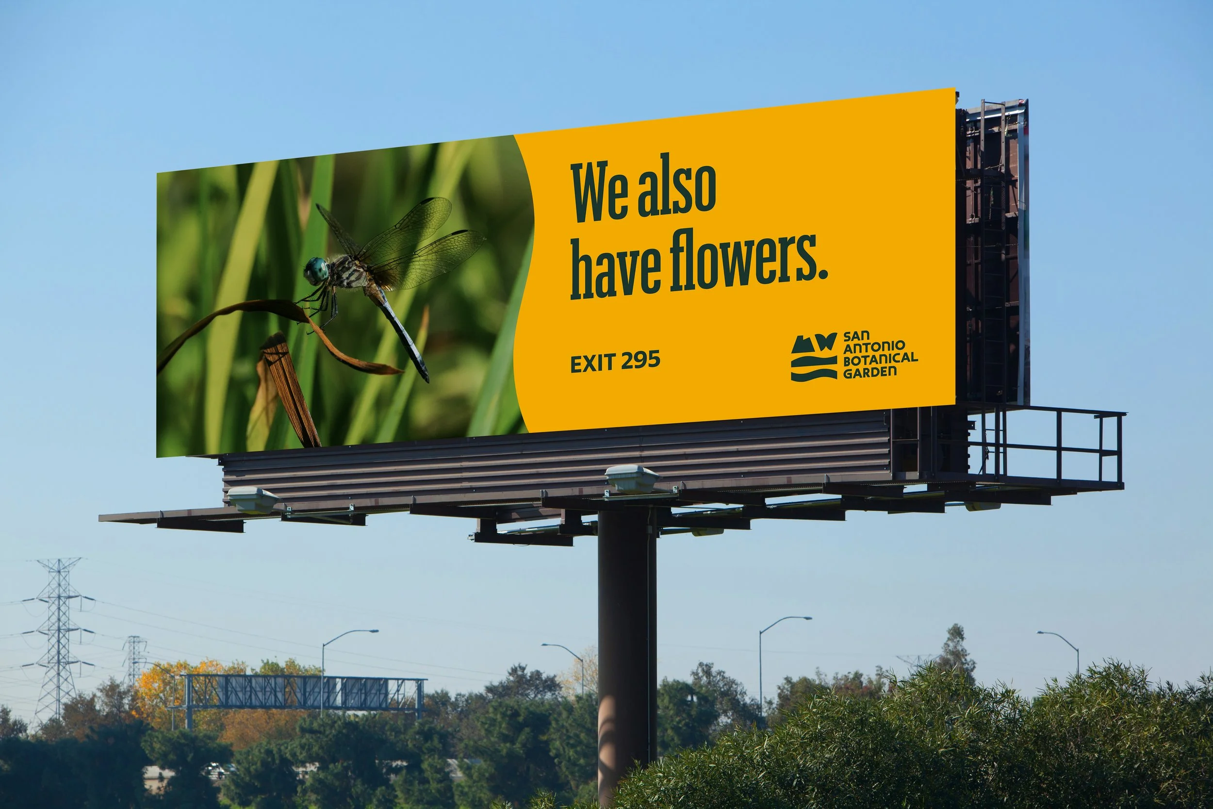
The new icon contains four glyphs, each representing a defining feature of the Garden. The building captures the conservatory, designed by world-renowned architect Emilio Ambasz. The Monarch symbolizes the Garden’s role as a critical stop along the butterfly’s annual migration south. The hillside is a reference to the Garden being located on one of the highest points in San Antonio. And the water represents their commitment to conservation, recycling 70% of all the water they use.
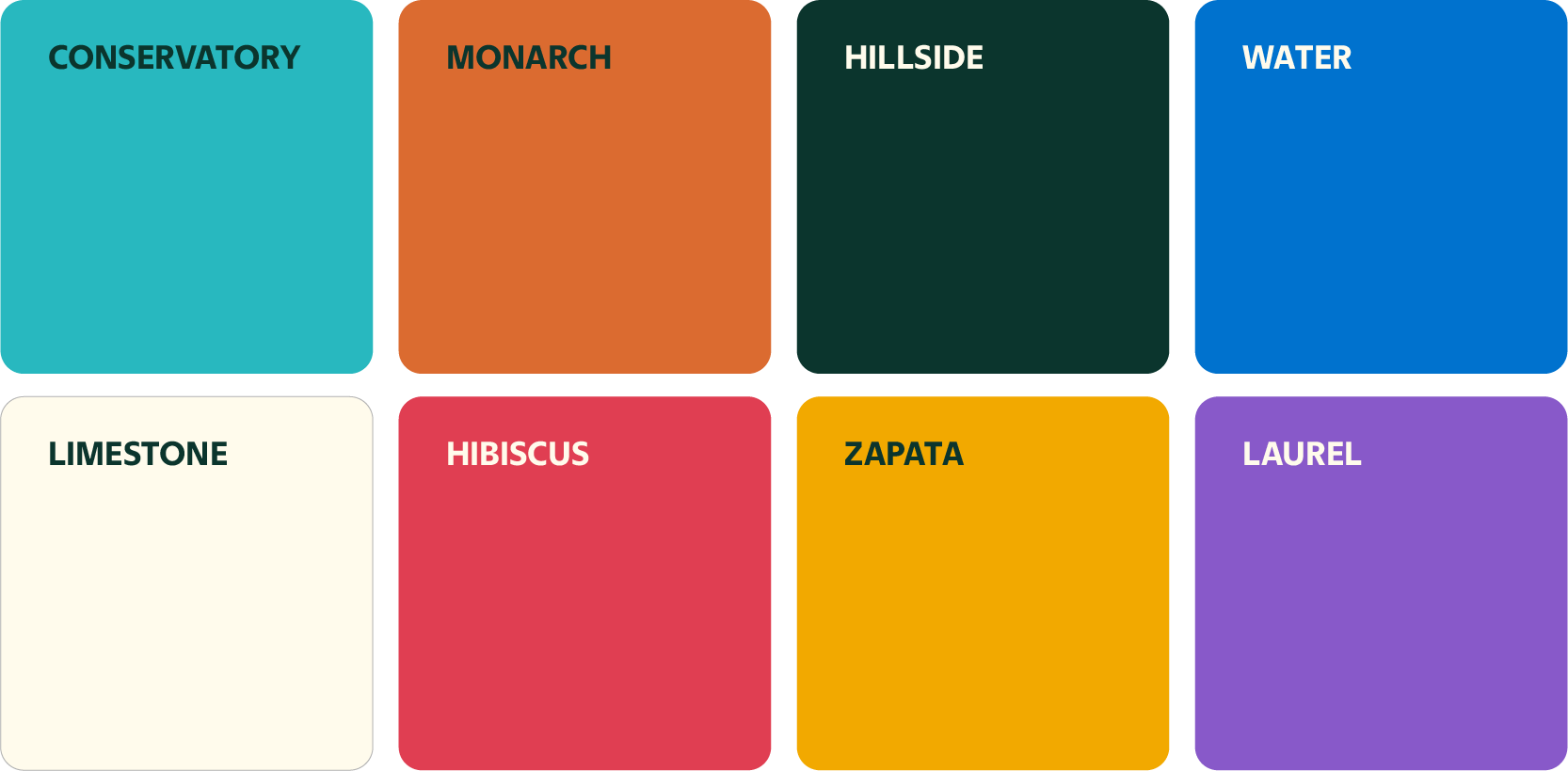
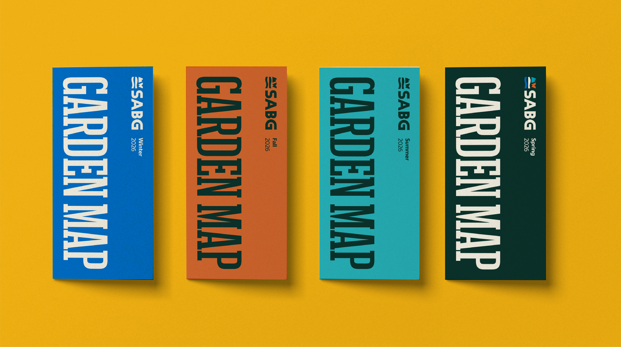
COLORS
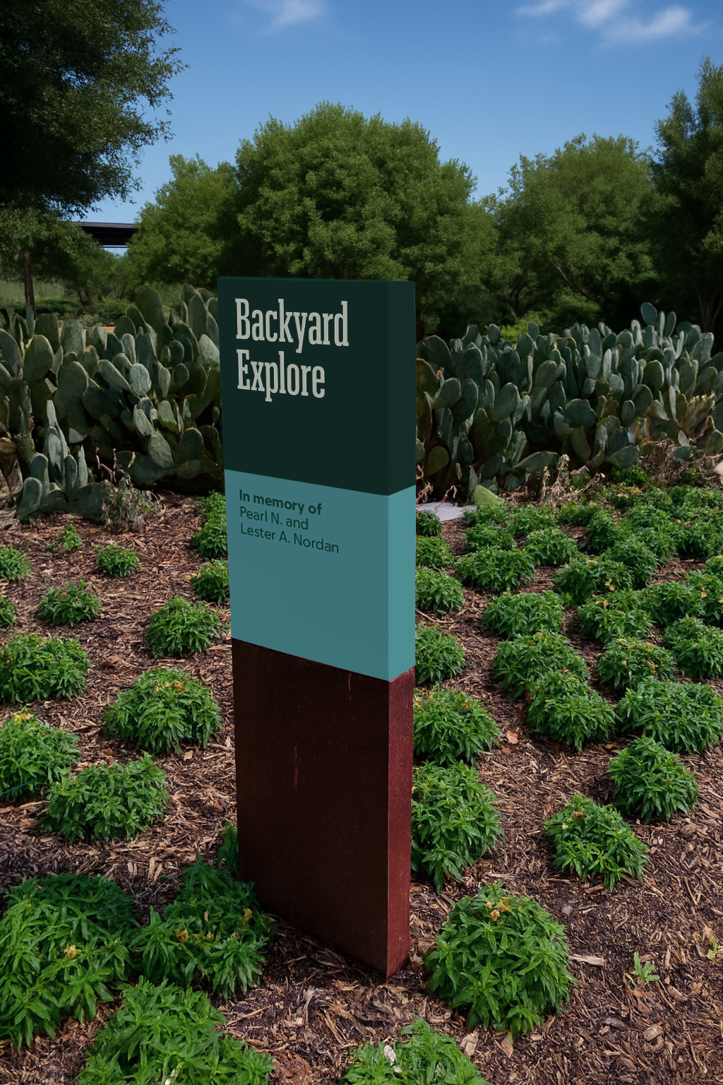
Color offered another way to help shift and expand peoples’ perceptions. The extended and dynamic palette is inspired by key features and plants found at the Garden. It’s also a nod to San Antonio itself — a city known for its vibrant and celebratory colors.

TAGLINE
SABG has always wondered “what if.” What if we build a greenhouse that doesn’t look like a greenhouse? What if we do more than display plant species and actually create new ones? What if we save rare and endangered Texas plants from going extinct? Their new tagline speaks to how they think and approach their work every day.
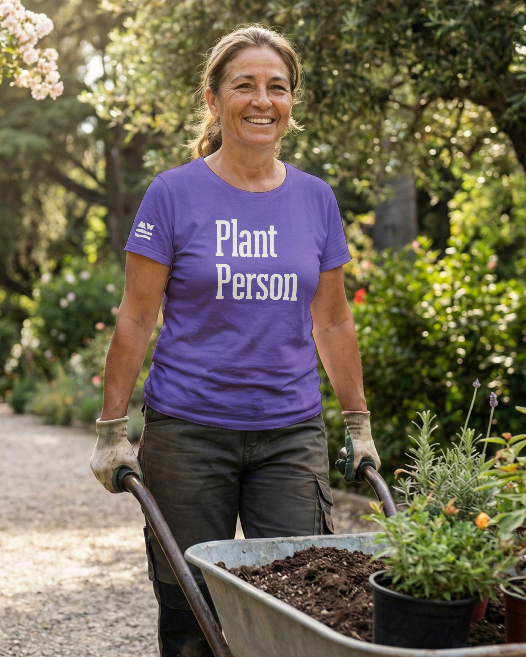
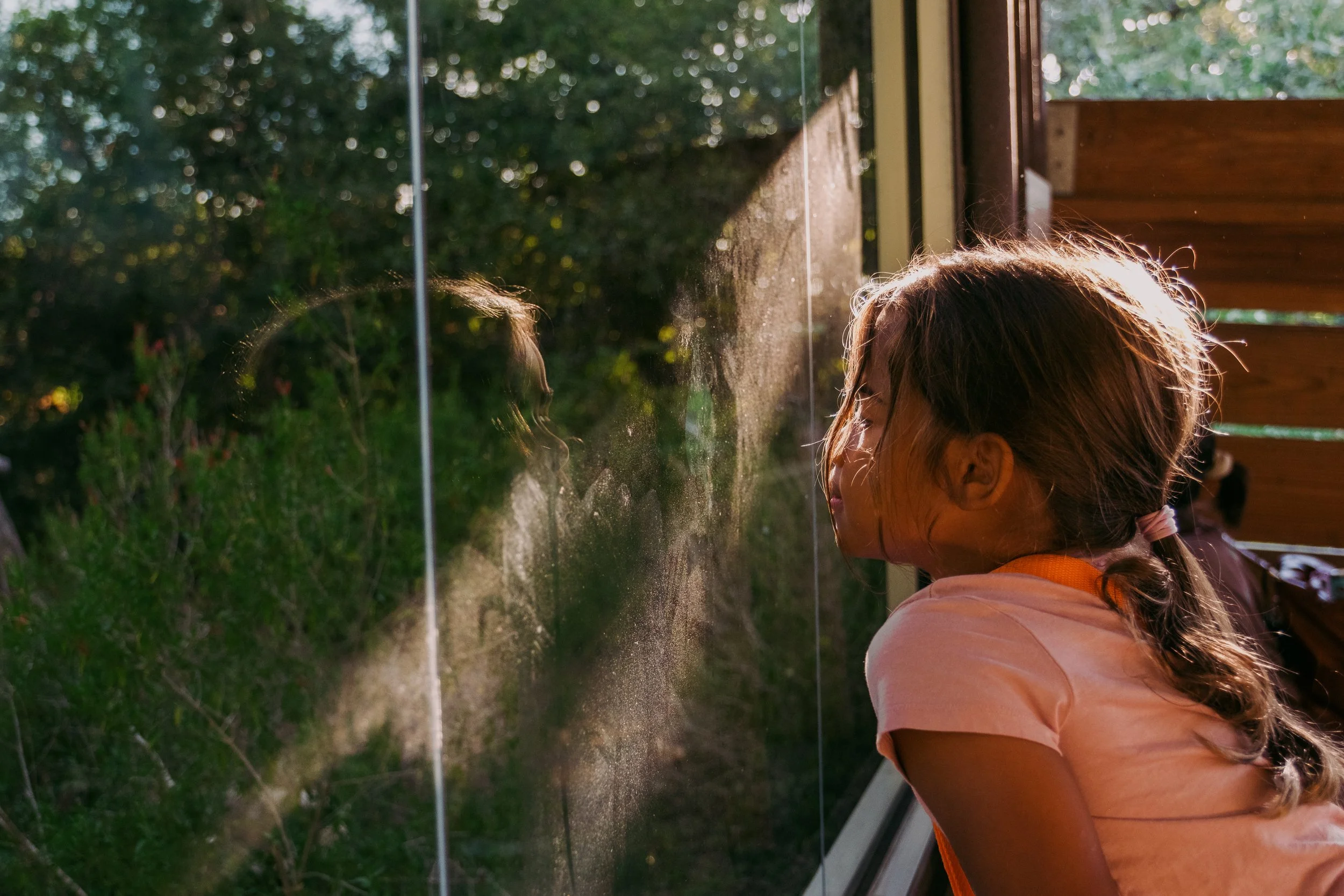
“Grow curious” is also an invitation to visitors to learn something new about the natural world and subtly suggests that there’s more to the Garden than they might have expected — further supporting SABG’s need to expand how people see them and attract new visitors.
“We’re building on 45 years of inspiring curiosity as we step boldly into our next chapter. Our new brand invites people to discover the wonders of the Garden while showcasing our pioneering conservation work.”
KATHERINE TRUMBLE, President & CEO, San Antonio Botanical Garden
PEOPLE
We covered a lot of ground during the development of this brand — engaging people from every department and level of the organization. Through blitzes, in-depth interviews, tours, multiple site visits and surveys, we leveraged the collective knowledge of the CEO, Chief Development Officer, marketing team, botanists, interpretation leads, the gift shop manager, board members, volunteers and more. Everyone contributed valuable insights that helped inform, shape and grow this brand.

EXPLORE MORE
We Are Blood
