SHIELD RANCH
A promised wildland.
CHALLENGE
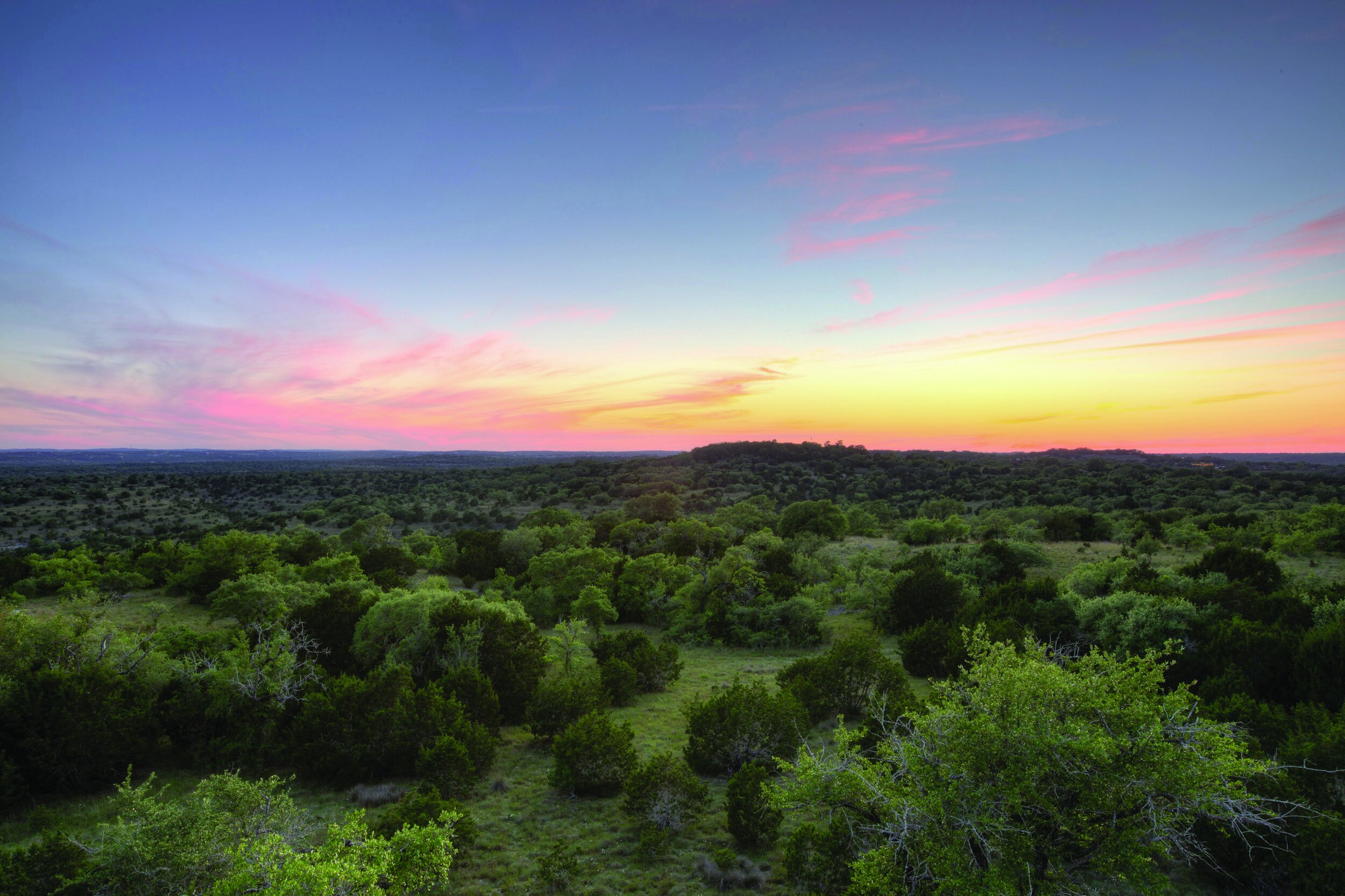
Shield Ranch began as a historic family ranch located just outside Austin. Over the years they’ve grown to three ranches encompassing 37,000 acres and have invested in an ambitious plan to protect the land and wildlife on them, essentially becoming private nature preserves. Yet to ensure these places stay wild for future generations, they needed to become more public and share their unique story of land stewardship.
VALUE
Less than 5% of Texas land is public. So protecting the state’s most wild places depends on private land owners. And for decades, Shield Ranch has quietly been building the model for how to do it right. We created a brand that represented all their hard work and good intentions, giving them a simple and compelling way to tell their story. They’ve leveraged it to help them inspire other landowners and to fuel a capital campaign that has raised $9 million in funding for innovative nature-immersion facilities and programs.
SERVICES
Blitz
Strategy & Positioning
Visual Identity
Narrative
Tagline
Brand Architecture
ICON OF CONSERVATION
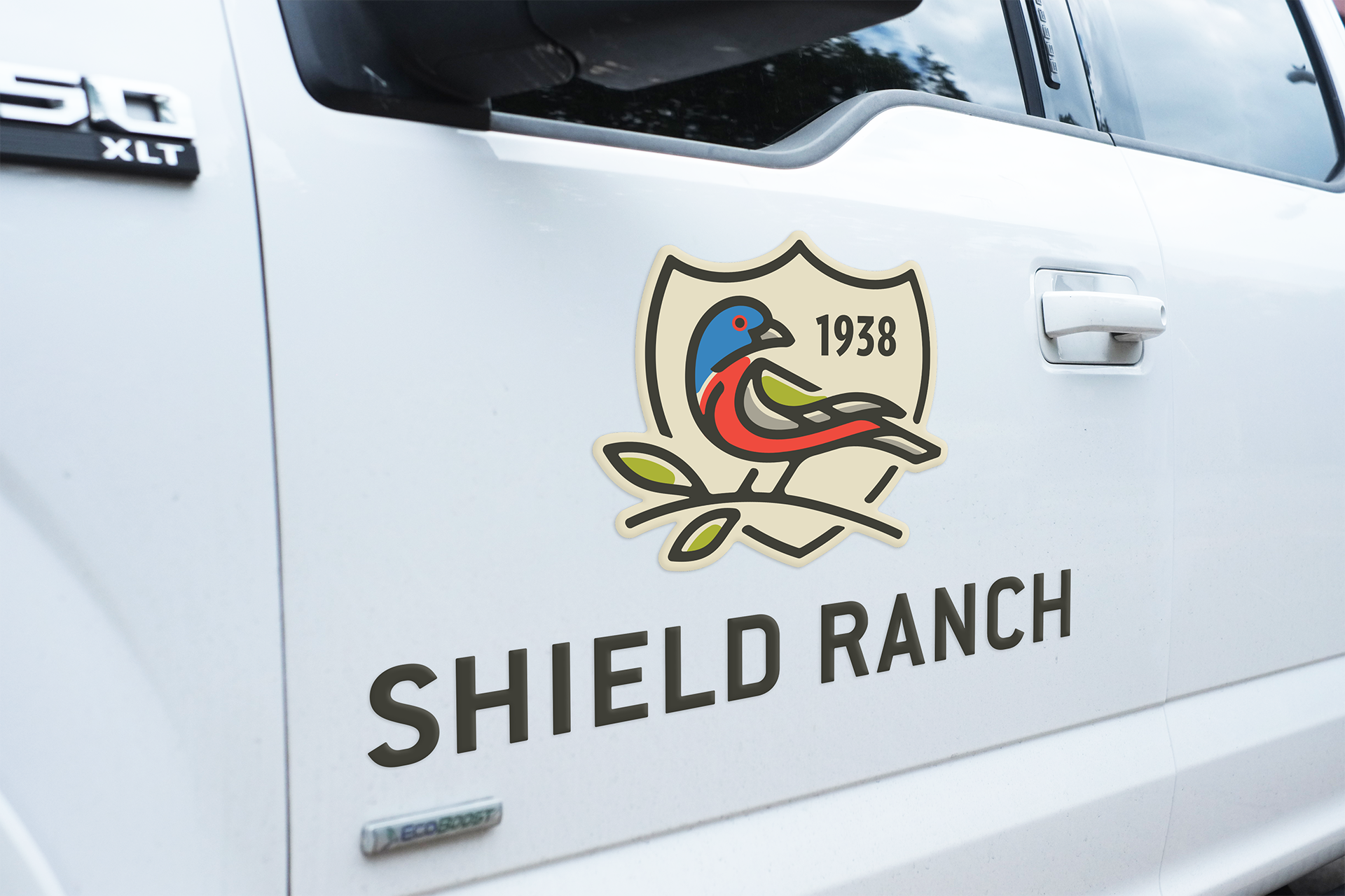
Shield, the family’s last name, could not have been a more perfect modifier to describe a ranch dedicated to protecting nature. But how do you represent something as big as nature in a single icon? We found inspiration in the painted bunting. The presence of this bright and colorful native Texas bird is often considered a sign of a healthy ecosystem. And because it can be found on all three ranches, it is a powerful symbol for the organization and its mission.
VISUAL IDENTITY
The original ranch was founded in 1938. And its very first brand was actually its cattle brand, which was fittingly a shield. So for the logo, we used that original shield shape to frame the painted bunting, encircling and protecting it. The founding date for the original ranch is placed in the corner, marking the beginning of the family’s deep connection to the natural world and also giving the overall design balance.
COLORS
Colors help convey a brand’s tone. While we love the symbolism of the painted bunting, its bright colors could project a very loud and bold brand. Yet, Shield Ranch is extremely thoughtful, methodical and sophisticated in their approach to land stewardship. So, we made the brand’s primary colors more neutral. The sandy limestone and rich bark colors were inspired by the natural landscape and bring balance to the brighter colors while helping the brand feel grounded, established and refined.
TAGLINE
Why should Texans care about protecting privately managed wildlands that they may never get to visit or experience? To engage new audiences, Shield Ranch needed to answer this question. We crafted a narrative that communicated why they matter—culminating in three simple words, “Wild for good.”
The tagline speaks to both their mission (to ensure wild places remain for future generations) and their ultimate goal (to benefit the greater good).
BRAND ARCHITECTURE
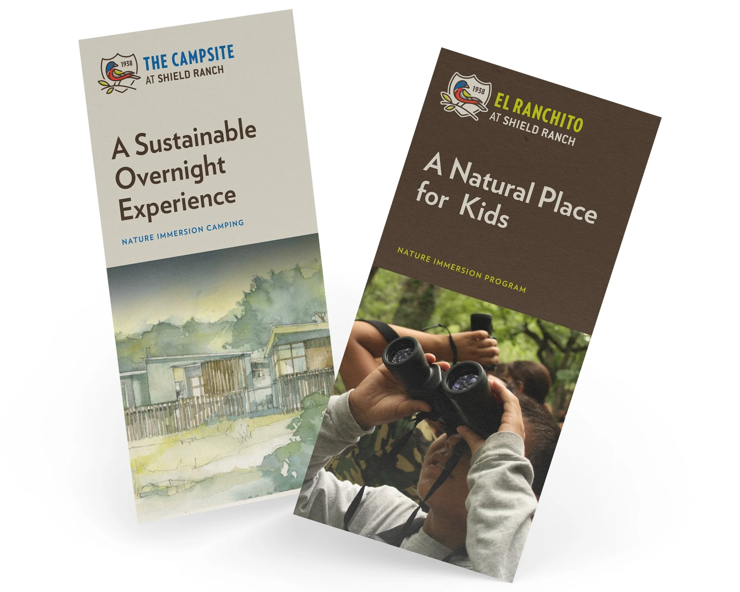
The ranch isn’t just one wildland. It’s three, which are located across Central and West Texas. It also includes programs that provide unique nature immersion experiences, including El Ranchito—a camp for kids. They needed a way to organize it all. We helped them create a brand architecture that gives the Shield Ranch brand more definition and the flexibility to keep growing in the future. This structure makes them easier to understand and ensures everything they do reinforces and amplifies the larger brand.
“Butler listened deeply to our story. And their artfully designed collaborative processes build the kind of trust that leads to an enduring friendship and an enduring brand.”
BOB A. AYRES, Ranch Owner & President of Shield Ranch Foundation
PEOPLE
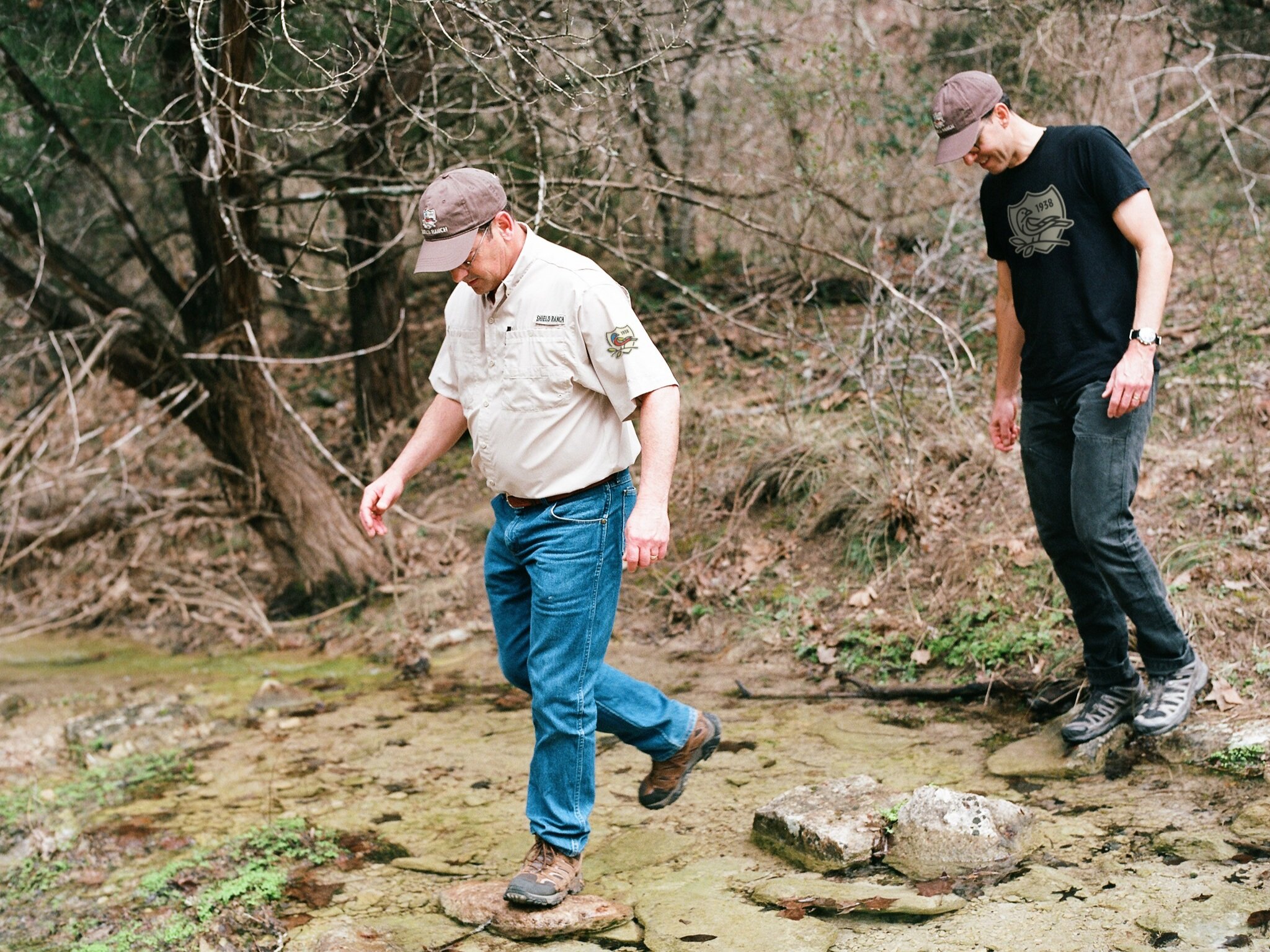
KEEPING IT IN THE FAMILY | The ranch has belonged to one family for more than 80 years. So to communicate the vision for its future, we collaborated with multiple generations of the family—including Vera Ayres Bowen, Bob A. Ayres and their mother Pat Shield Ayres whose father purchased the original ranch in 1938.

